
The paper you choose can completely change how your digitals look and feel. Colour vibrancy, print clarity, texture, and even how your finished pages fold or layer together all depend on the type of paper you use. Using the wrong paper can lead to dull colours, bleeding ink, or pages that feel flimsy and tear easily—while the right paper can elevate your whole journal, making it look and feel beautifully crafted.
Understanding Paper Weight: GSM vs LB
Paper thickness can be confusing, especially since the UK and US use different measurement systems. In the UK, paper weight is measured in gsm (grams per square metre), where a higher gsm means thicker, heavier paper. In the US, paper weight is measured in pounds (lb), but this varies depending on the type of paper, so there’s no exact conversion between gsm and lb. To help readers who use the US system, I’ve created a handy converter below—though it’s best used as a rough guide. Throughout this blog, I’ll be referring to paper weight in gsm.
Paper Weight Converter
💡 Tip: If you’re buying paper and unsure what weight to use, I suggest starting with 90gsm for general pages and 160–200gsm for tags or cards. That gives a nice mix of flexibility and sturdiness for junk journaling.
If your printer struggles with thick card, print on lighter paper and back it with something stronger.
Why Paper Weight Matters
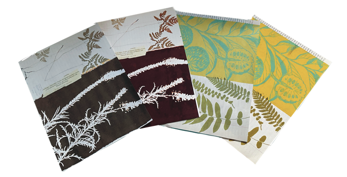
Paper weight affects more than just how thick or sturdy the paper feels—it also changes how your pages behave when handled, glued, folded, or stitched into a journal. Lighter paper (like 75–90gsm) works well for layering or creating that authentic “old book” feel, but it may wrinkle more easily or let glue seep through. Heavier paper (like 160–230gsm) is ideal for printing journaling cards, tags, covers, or anything that needs to hold its shape. Choosing the right weight helps your journal feel balanced and durable without becoming too bulky or stiff.
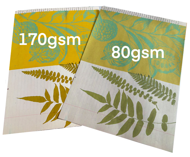
The type of paper you print on makes a big difference — The same design can look noticeably different when printed on 170gsm photo matte paper compared to 80gsm standard printer paper, with variations in colour vibrancy, sharpness, and overall finish.
Paper Finish
The finish of your paper—whether matte, glossy, or something in between—can have a big impact on how your digitals print.
Matte paper often gives a soft, vintage look. Glossy or satin finishes bring out vibrant colours and sharp detail—perfect for photos or rich designs.
Don’t forget how the paper feels. Some have a luxury, tactile quality; others are thinner and rougher, which can be used creatively. For example, print old letters or vintage documents on thinner or even low-quality paper to enhance that aged feel.
For detailed ephemera, I love using 230gsm Archival Matte Single-Sided Inkjet Photo Paper. It’s smooth, holds colour beautifully, and gives a professional finish.
“There’s no right or wrong paper to use—over time, you’ll discover what works best for your projects and the styles you love most”
Shifts in paper texture and weight are what bring depth and dimension to a junk journal. If you’re on a tight budget, it’s completely fine to stick with one or two types--but be aware that using the same paper throughout can sometimes result in a flatter, less layered look. Even mixing in one or two alternative textures can make a big difference. For example just adding some tea stained papers or the occasional piece of tracing paper.
Paper Colour: White, Cream, or Aged?
- Bright White – Ideal for clarity and contrast.
- Ivory/Cream – Softer, warmer, great for vintage styles.
- Tea/Coffee-Stained – Beautifully aged, but colours may shift slightly.
Always test print on stained or coloured paper to see how the colours turn out.
My Favourite Paper Combinations
- Tea-Stained Paper + Ledger Pages – Antique charm
- Archival Matte Photo Paper + Christmas Journaling Cards – Rich, vibrant colour
- Cream Cardstock + Vintage Florals – Soft and romantic
- Vellum + Typewritten Ephemera – Light and layered
Specialty Papers Worth Trying
- Vellum – Translucent and dreamy
- Tracing paper – A more affordable vellum alternative
- Hand-dyed or tea-stained paper – Adds character, test before printing
- Vintage Papers (Print Over Sheet Music or Book Pages) - A soft floral pattern layered on top can look beautiful and create instant depth and interest. Just make sure your base page isn’t too dark, and test a sample to check the contrast and clarity. These kinds of playful, layered textures are what make junk journaling so magical. Please read ‘A Note on Printing Over Found or Specialty Papers’, so as not to damage your printer,
A Note on Printing Over Found or Specialty Papers
When printing over vintage or delicate papers like sheet music, old book pages, or tea-stained paper, always make sure the sheet is dry, flat, and trimmed to the correct size (usually A4 or US Letter). Curled edges or uneven surfaces can lead to printer jams or misaligned prints.
If your printer has a rear feed slot, use it—it’s often better for feeding thicker or textured papers. And as always, test one sheet before doing a full batch.
Printer Settings for Best Results
To get the best print quality for your digitals, always check your printer settings before you hit print. Choose the highest quality or “Best” print mode, and select the correct paper type (e.g. matte photo paper, plain paper, or cardstock) to match what you’re using. If your printer has a rear feed tray, use it for thicker paper or card to avoid jams. You may need to play with these settings a bit—every printer is different, and colours can vary depending on the paper, ink, and printer model. Always do a test print first to make sure you're happy with the result.
When I’m testing a new digital kit or journal page, I usually print samples on a variety of papers, including 75gsm printer paper, 160gsm multi-purpose printer paper, 170gsm photo quality paper, 230gsm matte photo paper. I typically avoid adjusting printer settings so I can see how the colours appear on both lighter and heavier stock, as well as how they might look if someone doesn’t change their settings. While colours can vary quite a bit—especially on creamier or more absorbent papers—this method gives me a good sense of whether a design is ready to go.
A Note on Printing Costs & My Printer
Printing at home can get costly—especially when working with colourful designs or thicker paper types. While I personally use the Epson EcoTank ET-2850 with refillable ink tanks, which has saved me money compared to traditional cartridges, there are many other printers and ink systems out there. Some people prefer laser printers for speed and longevity, others invest in professional photo printers for the highest quality. It’s definitely worth researching different models, ink types, and paper compatibility to find what fits your budget and creative needs best. Remember, printer costs vary widely, so testing and comparing can help you get the best value for your printing projects.
Final Thoughts
There’s no “one size fits all” when it comes to printing for junk journaling. Test a few different weights and finishes. Mix textures. See what works best for your printer and style. It’s all part of the fun of making journals that feel truly personal and tactile.
If you found this helpful, I’d love to hear about your favourite papers too! Tag me on Instagram @welllovedjournals.
Happy printing and happy journaling 💛
-- Well Loved Journals
Affiliate Disclosure
Some links in this post are affiliate links, which means I may earn a small commission at no extra cost to you. These help support my small business and let me share free content. I only recommend products I use or trust, but encourage you to research and find what works best for you. Thanks for your support!
Leave a Reply